What Is 'YemekSepeti Banabi'?
Banabi is a supermarket shopping feature within the YemekSepeti application that allows users to order more than 2,000 market products and deliver their orders within 15 minutes to their address.
As part of the UX Design Course that I was enrolled in at Userspots, I chose Banabi as a case study. My goal was to challenge myself by rethinking the experience of a digital product that I frequently use and improve its user experience.
Role
UX Designer
Time
May - Aug 2021
Skills
• User research
• Mobile UI design
• Rapid prototyping
• Usability testing
How might we increase usability of YemekSepeti Banabi?
Design Process
As visualized below, I used design thinking methods to understand users' problems and develop creating solutions.
DISCOVER
Competitive Analysis
I assessed the strengths and weaknesses of Banabi's direct competitors: Getir and Migros Sanal Market. This analysis helped me to identify opportunities for improvement for Banabi.
User Research
The goal of the research phase was to gather crucial insights from the users. I interviewed people who use Yemeksepeti Banabi and open-ended asked some questions to understand the product's weaknesses better.
DEFINE
Affinity Mapping
Affinity mapping
I mapped affinity after interviews. It gave me an idea of the problems users are currently facing. I categorized these opportunities into three main categories:
1- Browsing products
2- Page layout
3- Customer satisfaction
4- Other feature requests
User Persona
I analyzed the common goals and problems of users and created a user persona with them. It helped me to put myself into the shoes of our users before moving into the ideation process.
What are these common problems ?
- Not always having access to fresh products.
- Not being able to find every brand product they are looking for.
- To be informed after the order is completed due to the fact that the remaining product number information is not shared.
- Not getting information when finished products are reloaded.
- Lack of details of the contents of boxed products.
- High prices of products.
- Not making color options on some products.
- Low variety of fruits and vegetables.
IDEATE
Sketching
I began to sketch solutions targeting each user problem that I identified previously.
I graded each idea based on its feasibility and impact. As a result, I decided to focus on three solutions
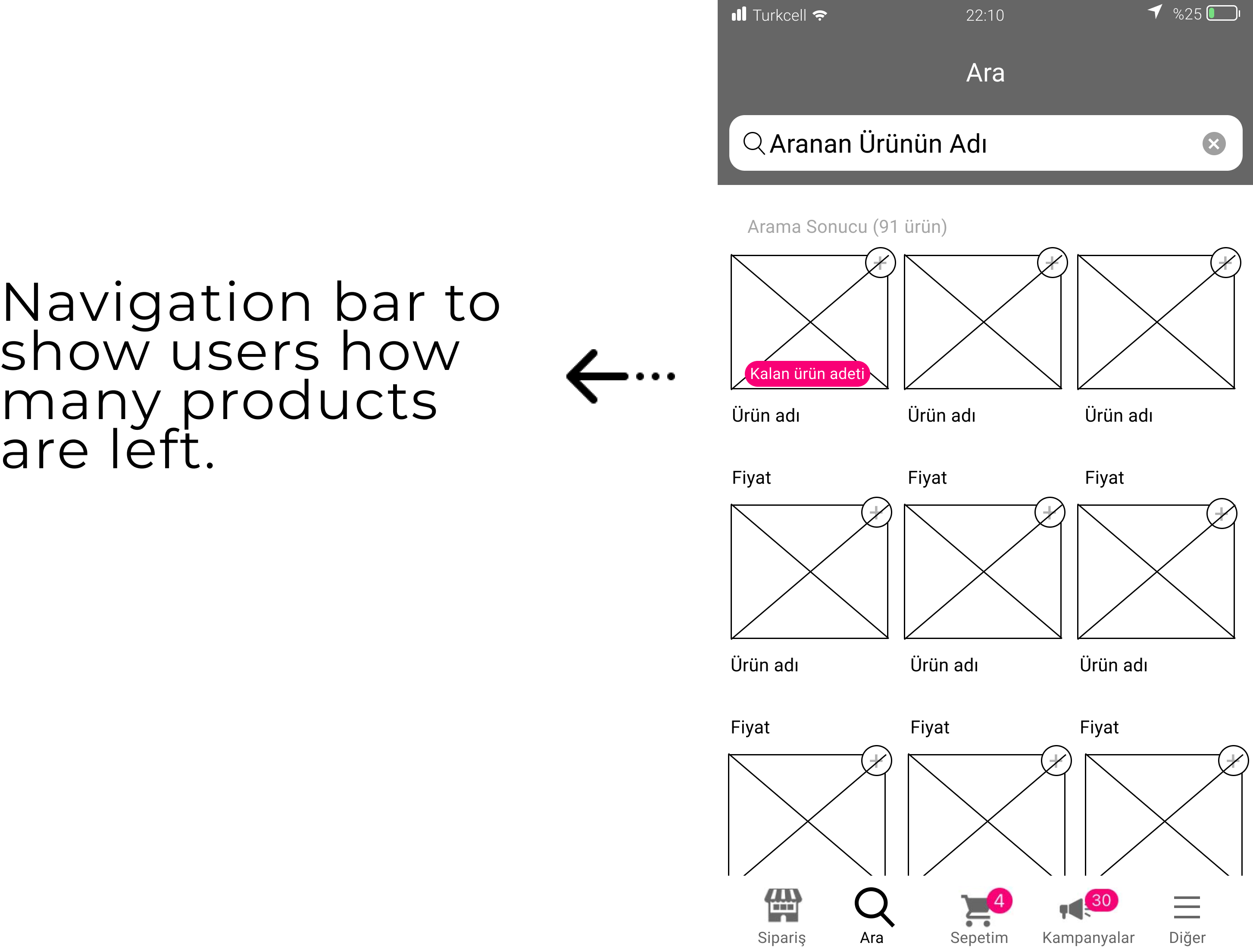
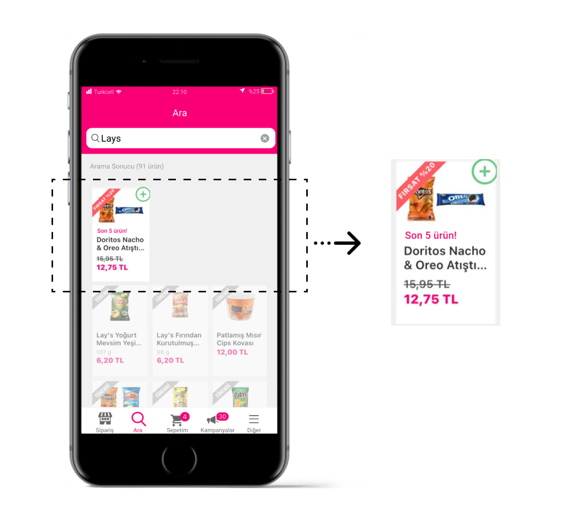
1- Show users how many products are left by adding a "stock countdown bar" when stocks are limited.
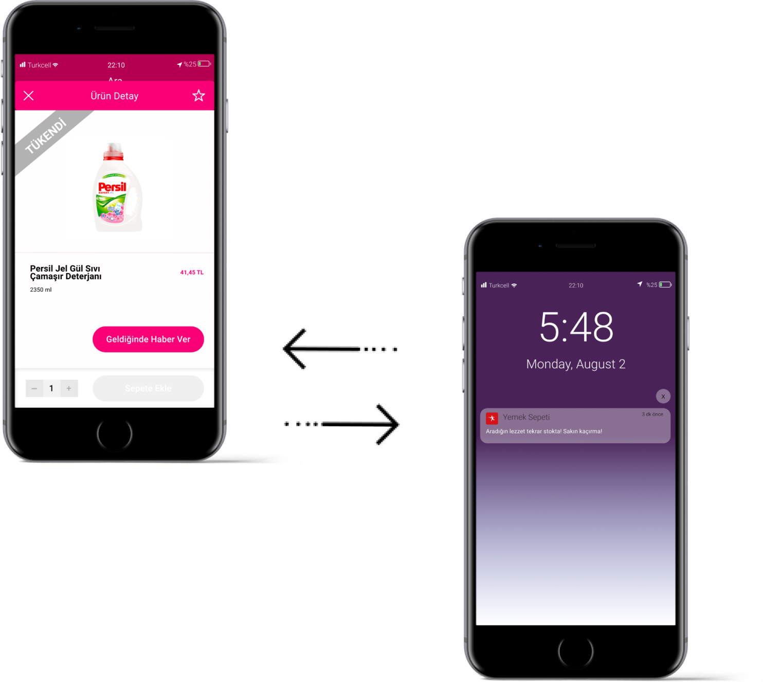
2- Give users an option to be informed when finished products are back in stock by adding a "button."
3- Notify users when finished products are in stock again if they enable notifications.
DESIGN
Wireframing
I brought the recent that solutions into higher fidelity.
TESTING
Feedbacks
I presented these concepts to users in the form of wireframes. Users well received the initial ideas. In the next phase, I decided to focus on improving usability.
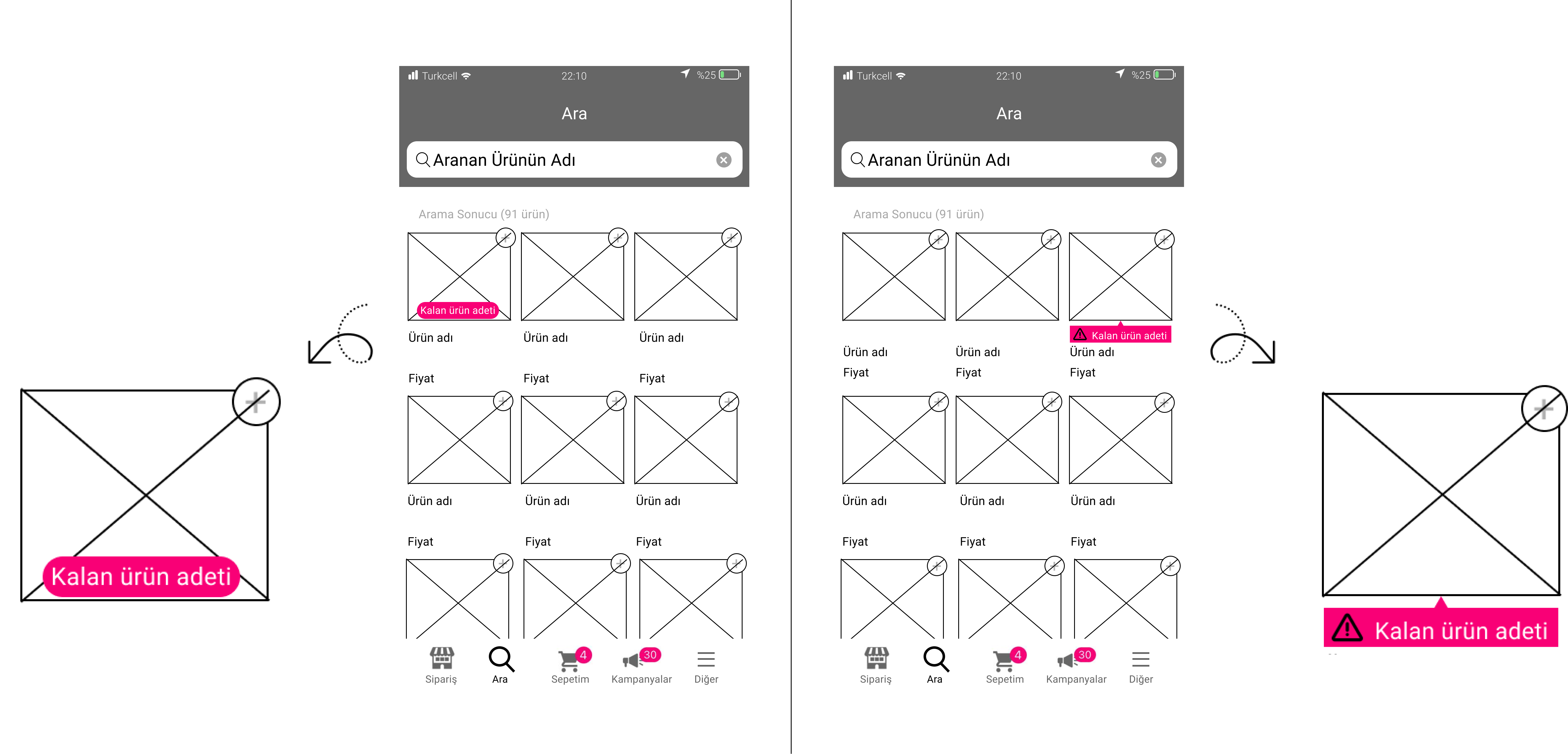
Solition 1 - Information Bar
Showing the information bar on the image can make design complex.
User chosed the bottom bar which make the design more simple.
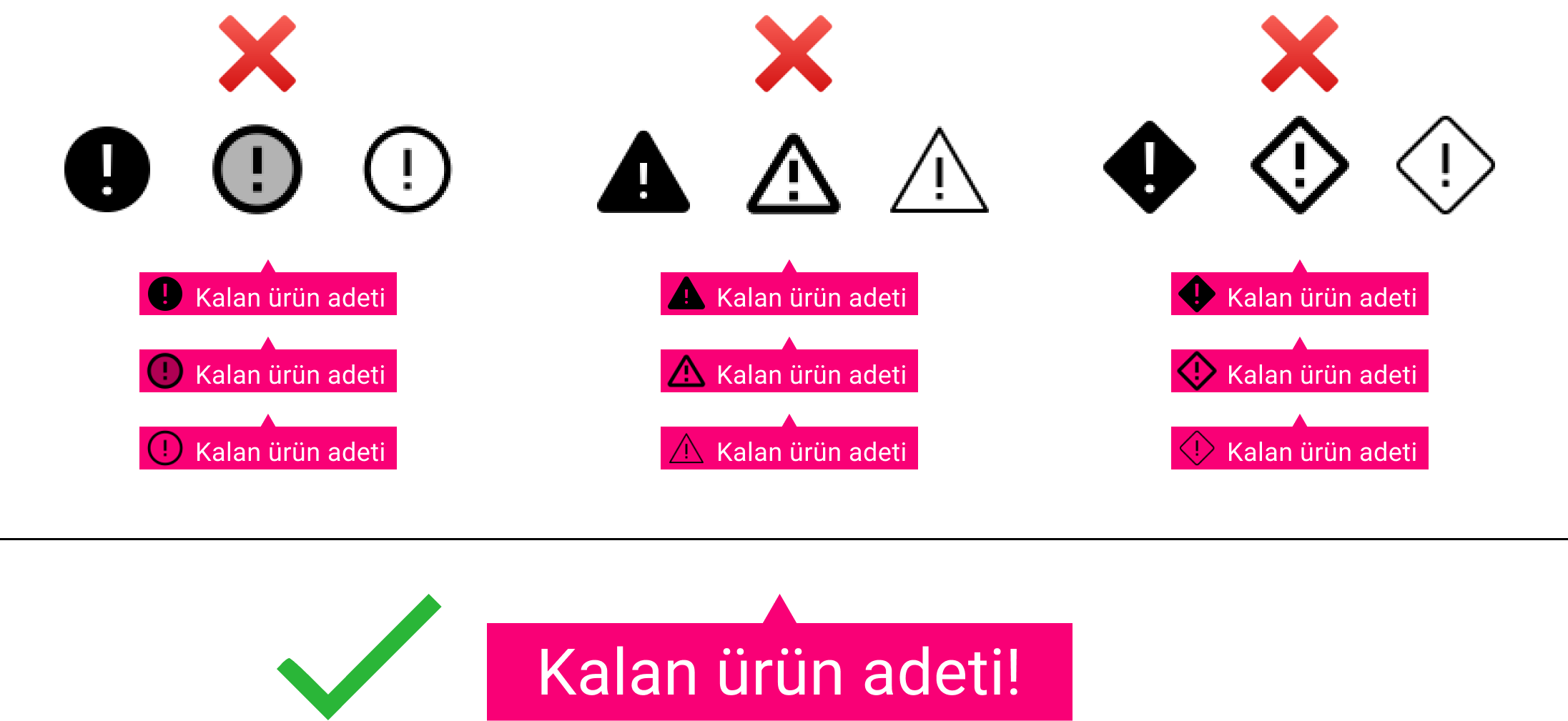
Solition 2 - Choosing Icon
Using the icon on the countdown bar is not always necessary. It depends on the bacground of app.
Not using icon selected by users.
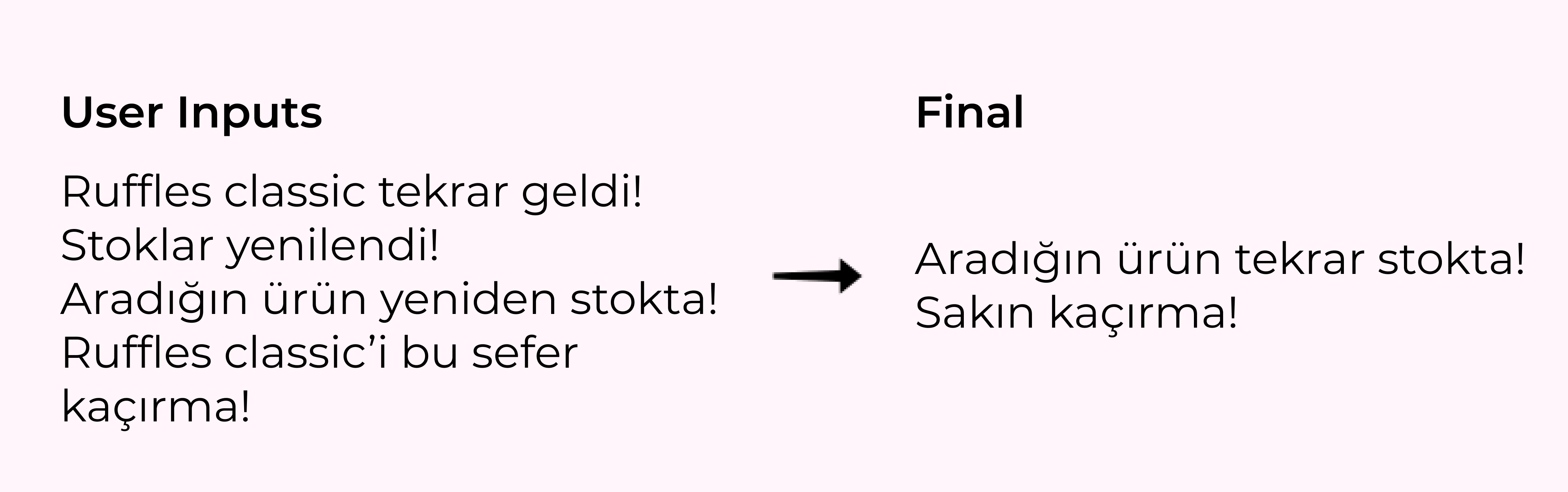
Solition 3 - Catchword
I asked to users ' what do you want to hear when the product you are looking for is on stock again?' to find the perfect catchword for the notification. I mixed common words from users says and created last design.
Hi-Fi UI Design
On the basis of all the user research & analysis I created the final UI Design Prototype.
Stock Countdown Bar
Notification and Button
Selected Works
CamperProduct Design, Mobile App
NIKU BakeryGraphic Design, Branding
Earnado / MikroloProduct Design, Web App
LITPM PodcastGraphic Design, Branding
YemekSepeti BanabiMobile App, UX Design, User Research