Customer requests
Outcome
Design a logo that creates a warm and friendly feeling like home
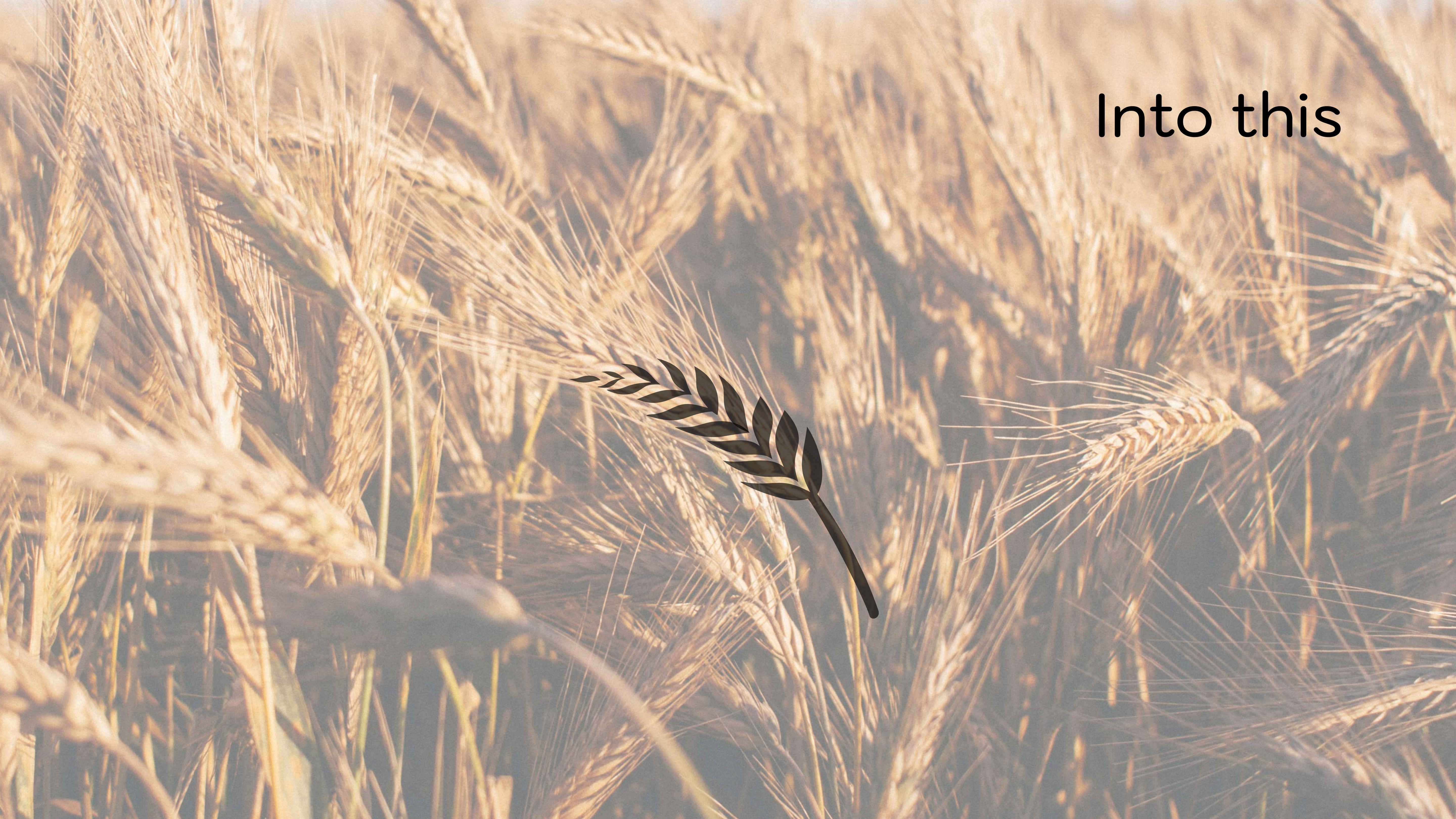
Give prominence to wheat
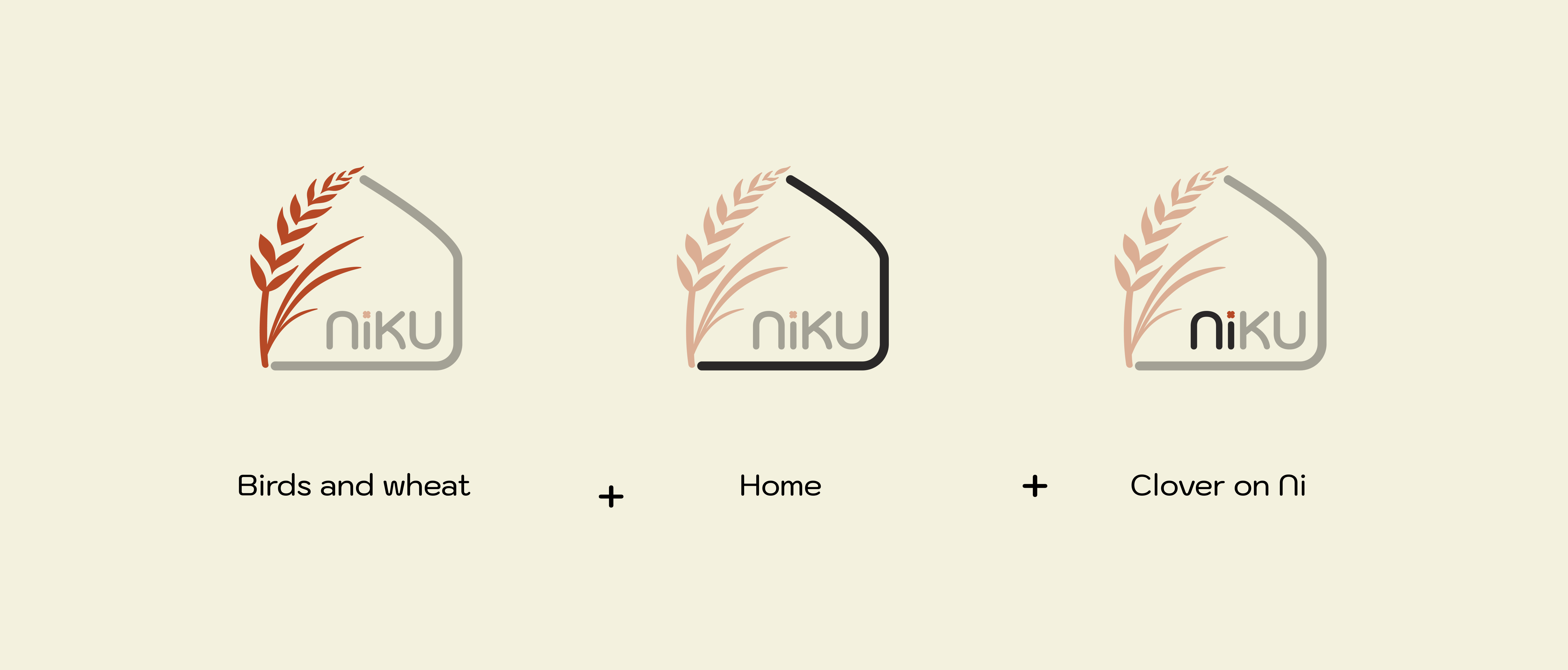
Include symbols of the clover and seagull, which hold personal memories for the customer, in the logo.
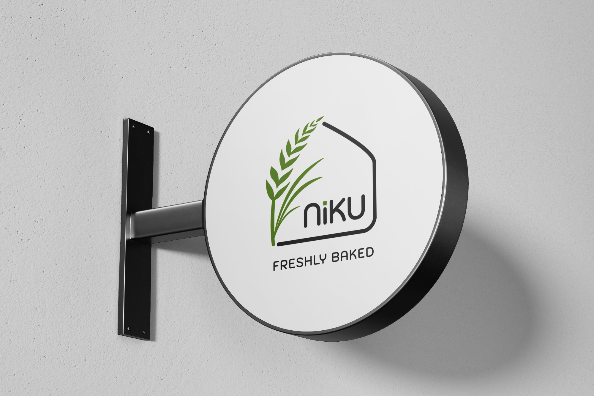
This logo effectively embodies Niku Bakery values and the quality of the products it offers to its customers. This design, which is both visually appealing and meaningful, strongly represents Niku's brand identity.
Story of Niku
The logo for Niku Bakery that I designed elegantly incorporates all the elements requested by the customer. The logo creates a warm and friendly feeling by featuring a structure resembling the shape of a house, symbolizing the bakery and patisserie's offerings that make customers feel at home.
Wheat is given priority, with the green color representing the emphasis on freshness and naturalness. This signifies that sourdough breads and other fresh products come directly from nature.
The seagull symbol, representing the customer's memories, is incorporated into the wheat leaves, while the clover symbol is also added to the logo. These symbols communicate that Niku's products are not only delicious but also special and meaningful.
The addition of the phrase "FRESHLY BAKED" at the bottom of the logo emphasizes Niku's commitment to freshness. The use of a modern and clean font achieves an appearance that is in harmony with the overall design of the logo.


Selected Works
CamperProduct Design, Mobile App
NIKU BakeryGraphic Design, Branding

Earnado / MikroloProduct Design, Web App
LITPM PodcastGraphic Design, Branding
YemekSepeti BanabiMobile App, UX Design, User Research