Description
Iterations
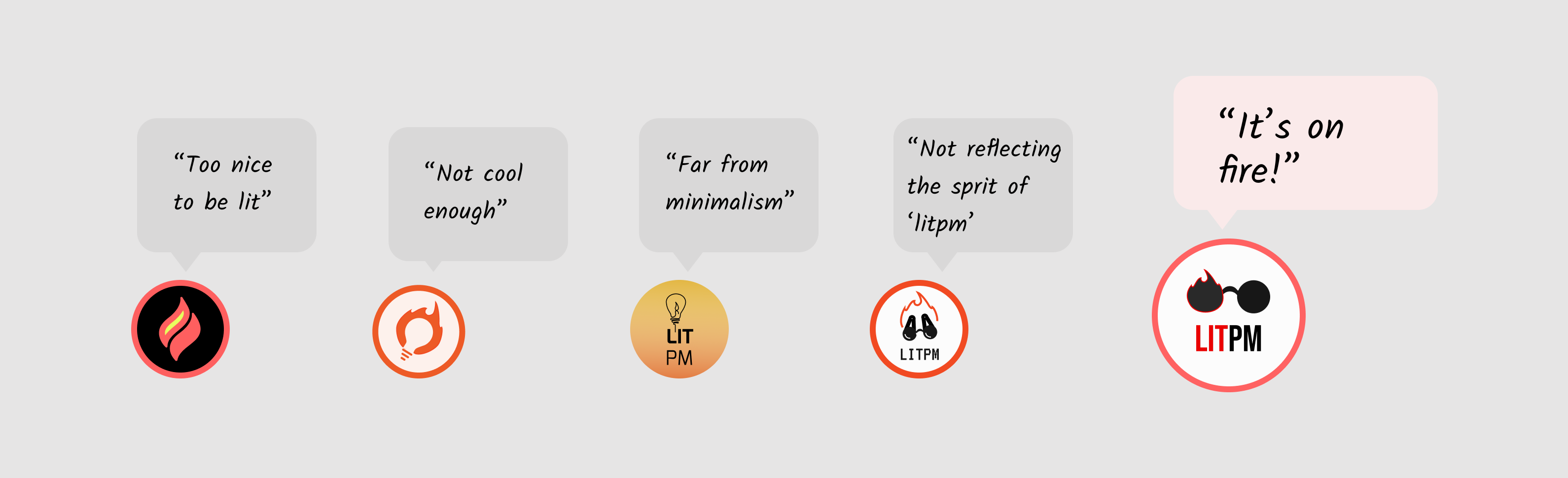
I analyzed the sharings and listened podcasts to understand the purposed of the LITPM. After all heres some of logo works and feedbacks from the customer.
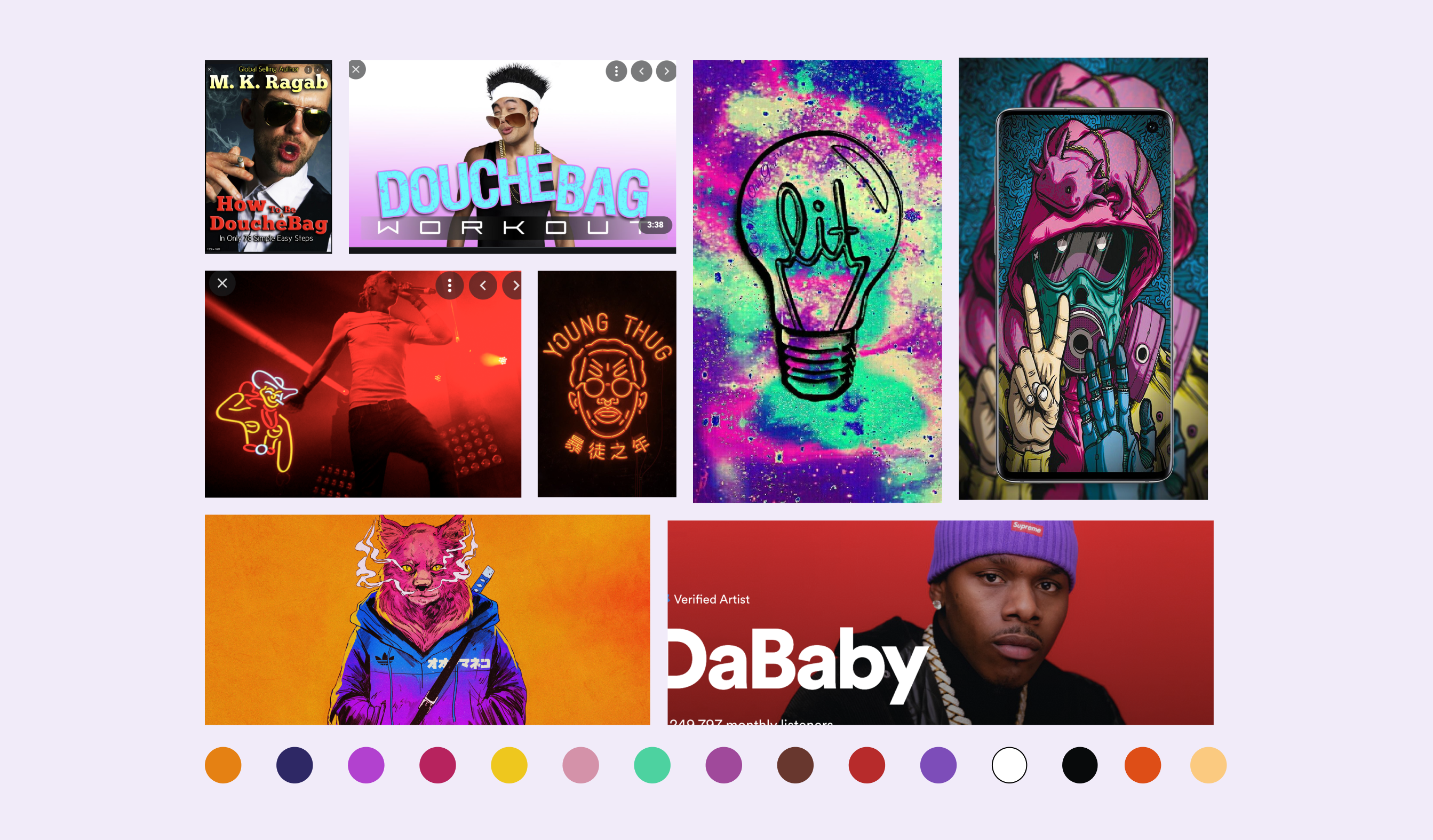
Moodboard
Concept Development
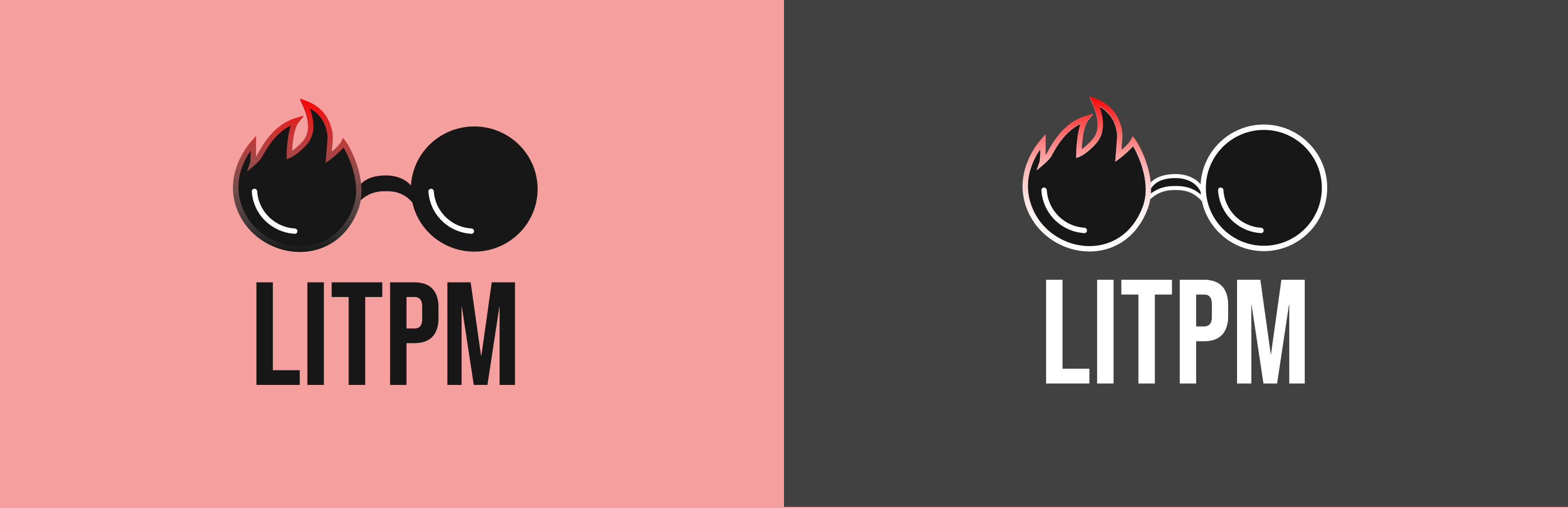
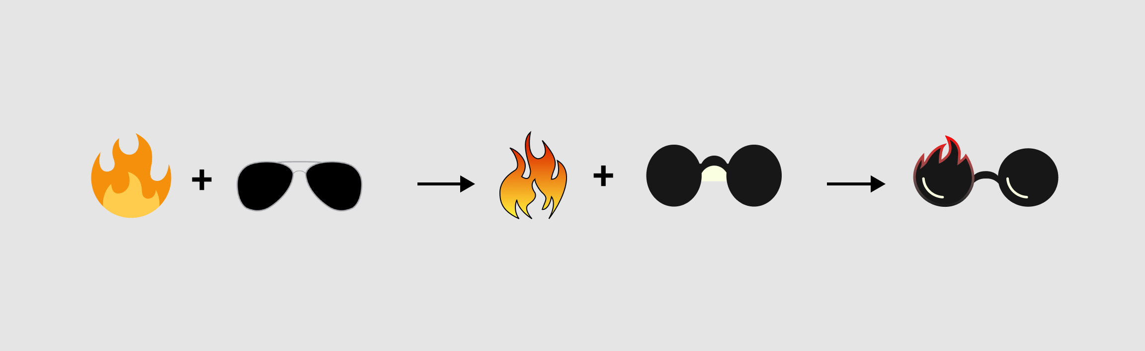
Based on clients feedback I decided to combine two different concepts;
fire and sunglasses.
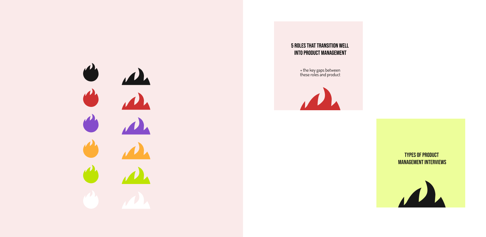
Illustration
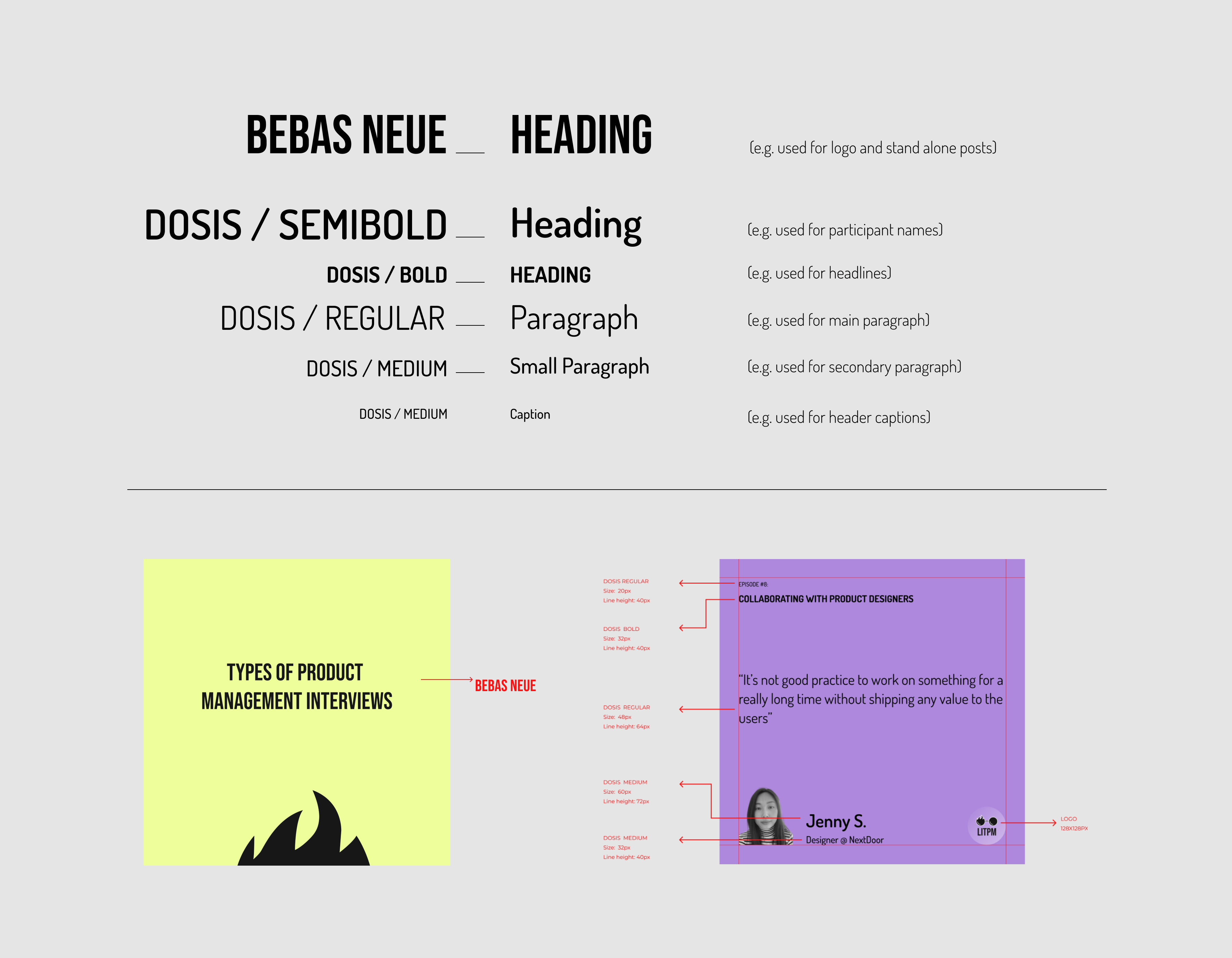
Typography Font
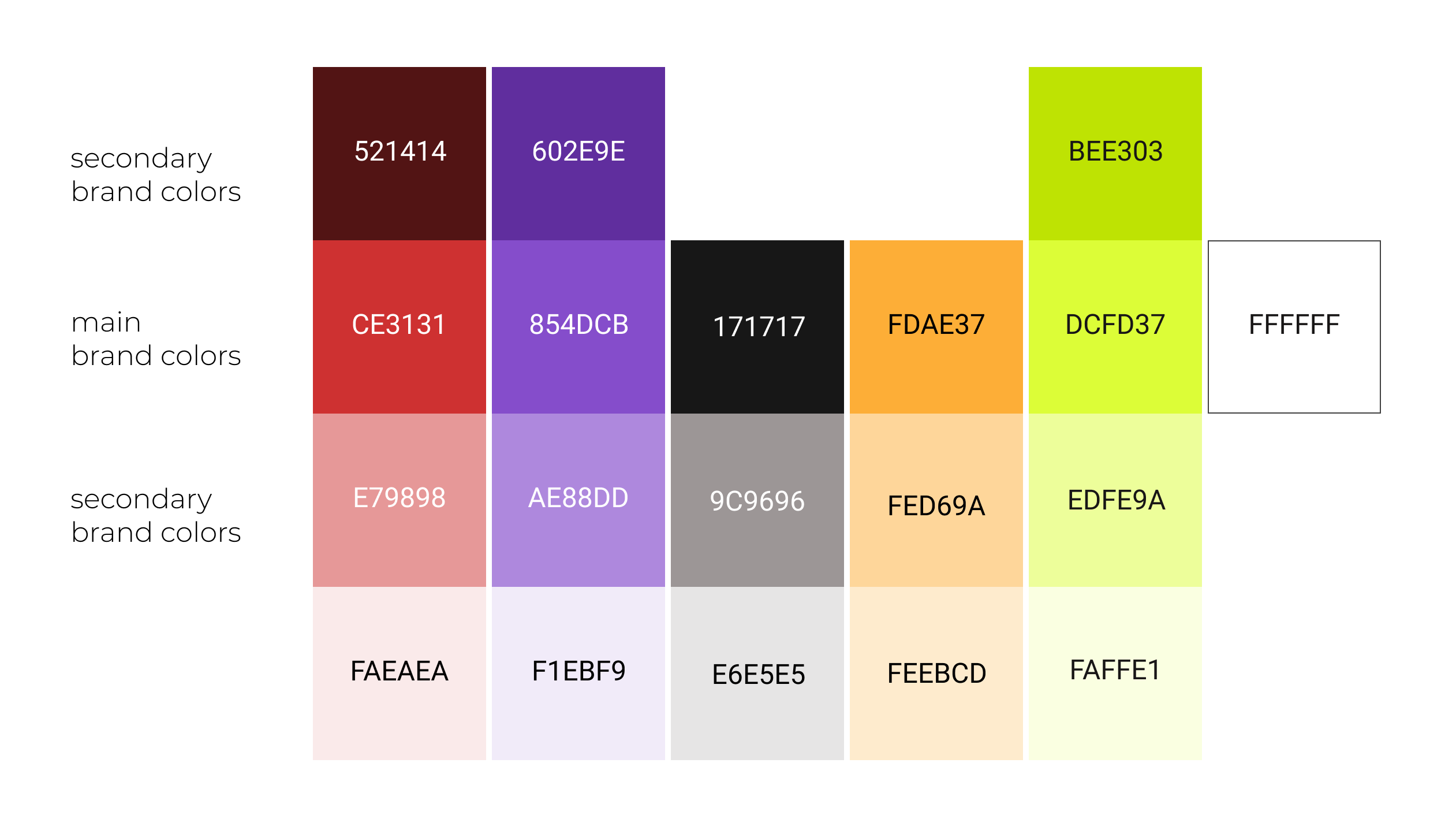
Color Palette
Brand Principles
- Try to stick with 1-3 colors while creating social media posts. Think how they will all look together on one page. Using a different background color for each post creates visual inconsistency for your brand.
- Try not to introduce a new color to the palette while creating instagram posts. If you really need something different, try to use one of the secondary colors or generate a different shade by changing the lightness value of the main color.
Selected Works
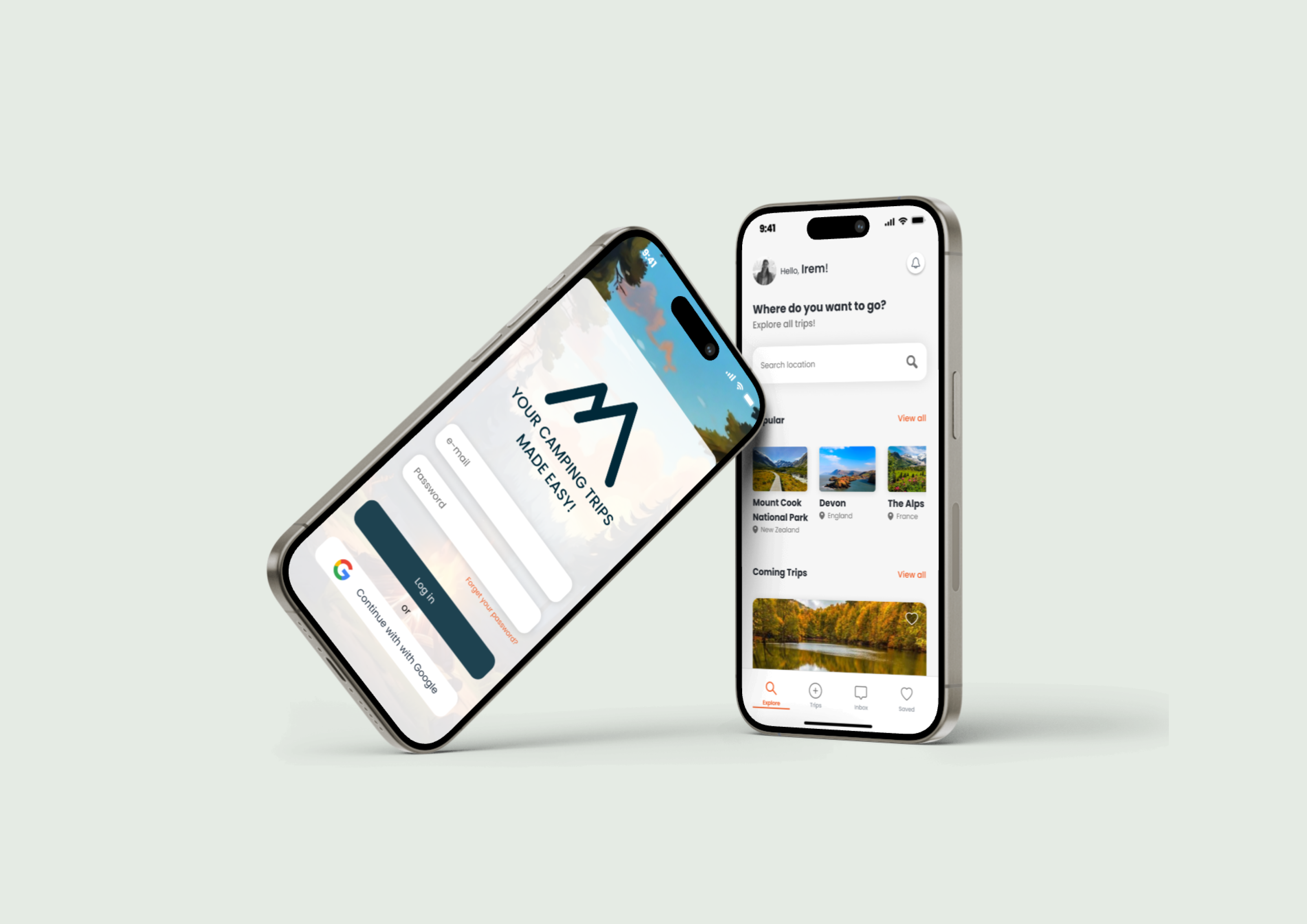
CamperProduct Design, Mobile App
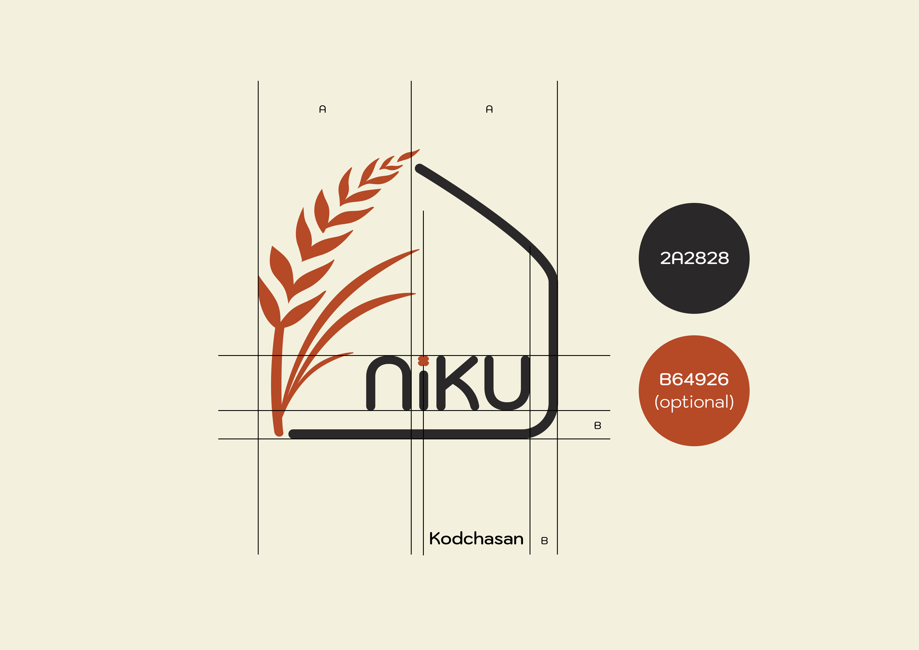
NIKU BakeryGraphic Design, Branding
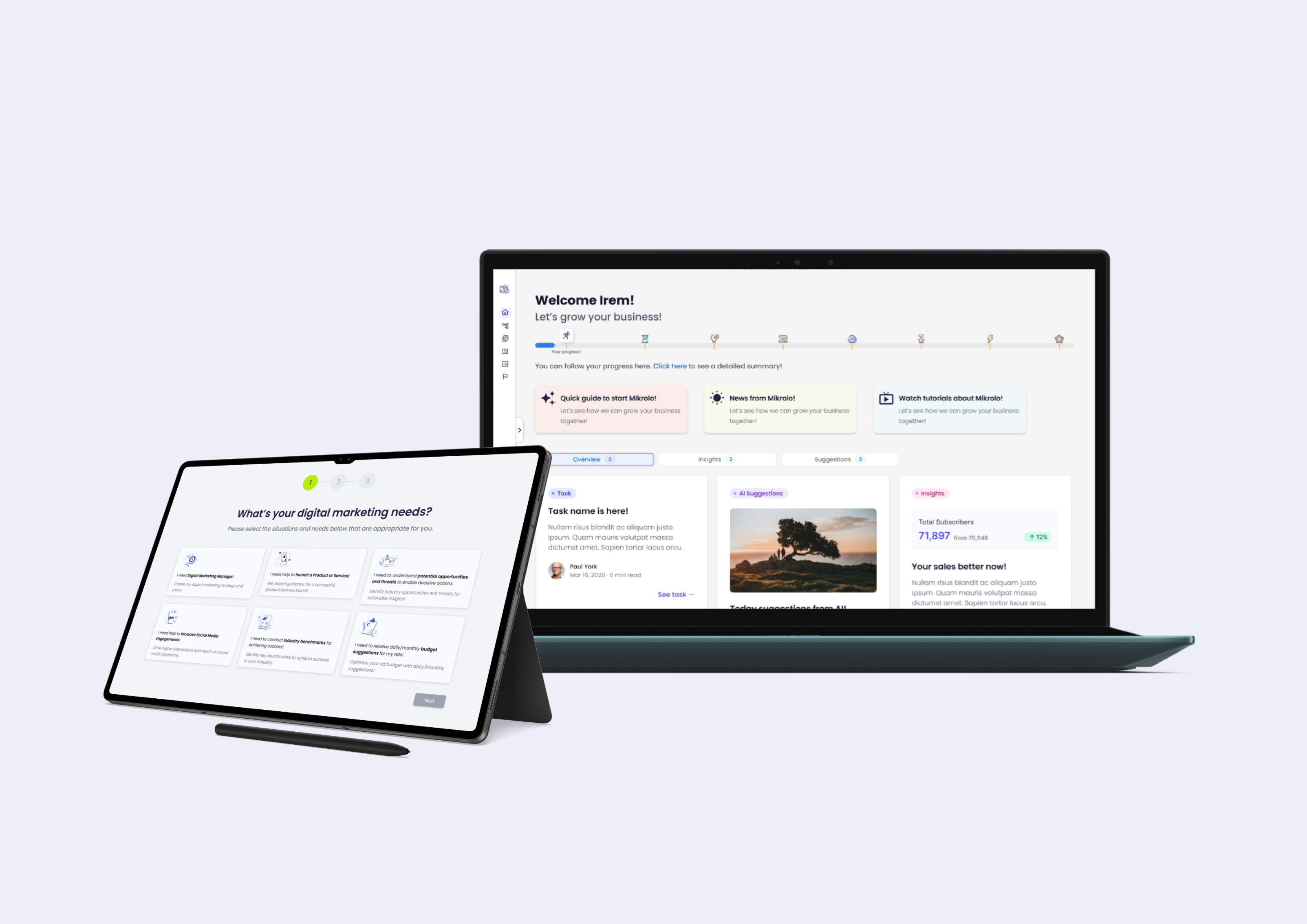
Earnado / MikroloProduct Design, Web App
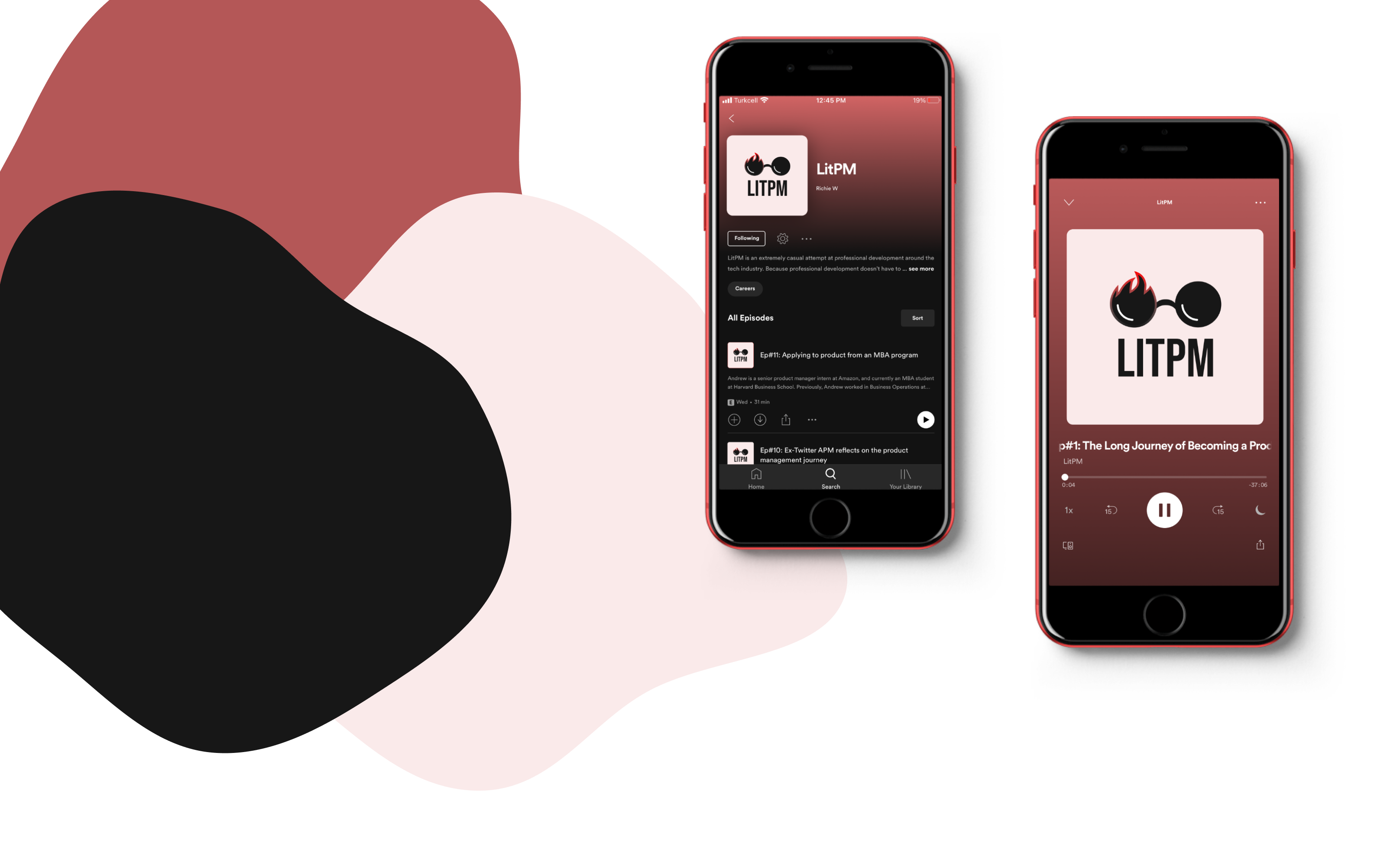
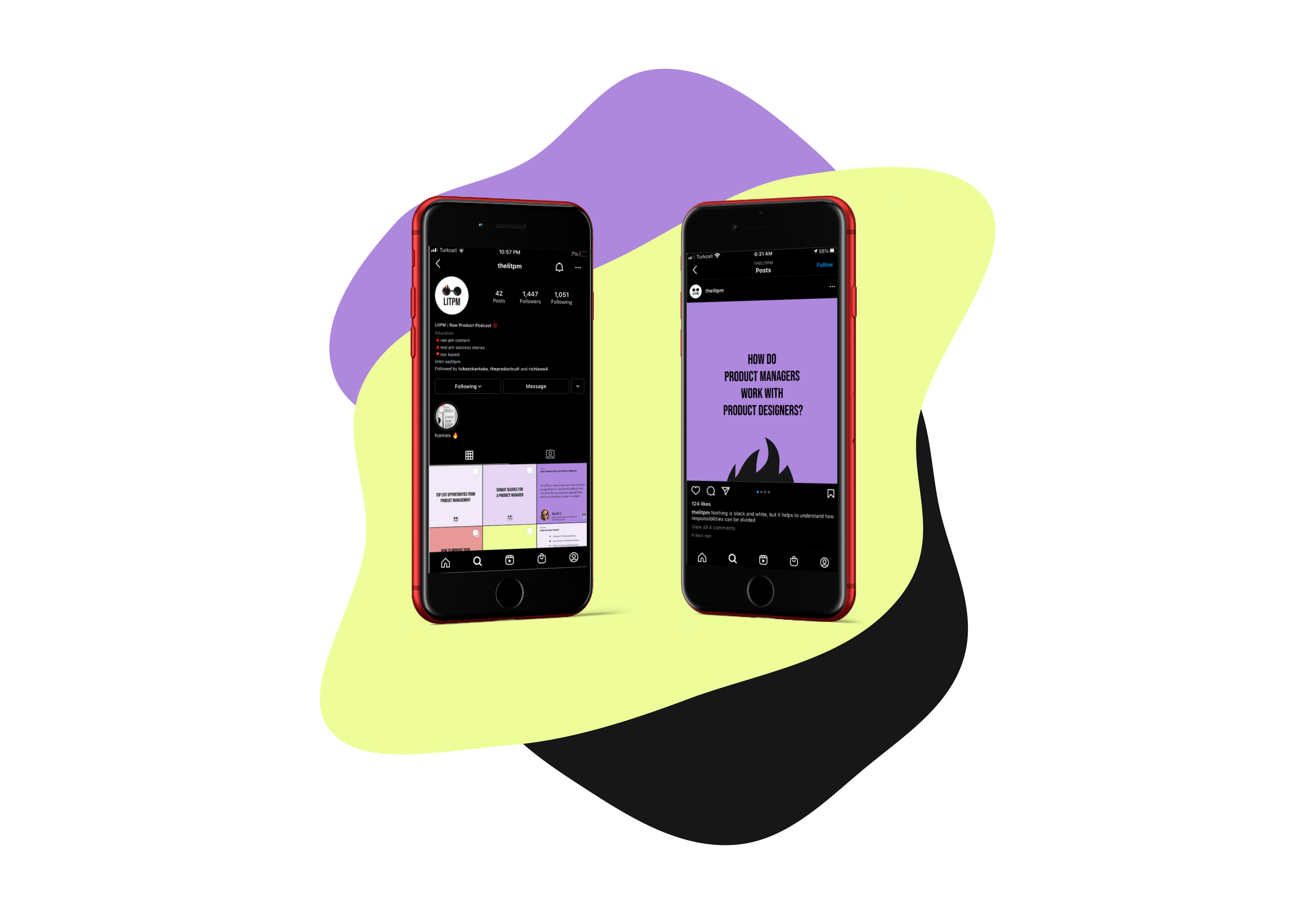
LITPM PodcastGraphic Design, Branding
YemekSepeti BanabiMobile App, UX Design, User Research